fido app redesign

(unsolicited)

Summary

Updated the Fido app by modernizing the user interface, improving critical user pathways, and adding functionality that’s currently missing.

Background

I’m a happy Fido customer. They have great mobile plans (for Canada) but they have an awful app, so I decided it warranted an unsolicited redesign.
 
From the moment I downloaded their app, I noticed their UI was out of date. The problem has only worsened as design trends continue to change year over year while Fido’s UI remains the same. Apps that fail to keep up with current UI trends risk looking outdated at best and, at worst, untrustworthy.

But the catalyst for this project was the number of times I had to leave the app and redirect to the Fido website. Worse, I left the app for tasks that should be core to a telecom company, such as changing my plan. Although Fido is a utility app and thus has more staying power, it is becoming difficult to convince users to download and keep an app on their phones. Especially if that app frequently redirects users to the website. Reducing redirects is critical to retention and user experience and can also have a direct effect on revenue. There is no better time to convince users to upgrade their plan than when they are staring at their last few megabytes of data. This is a critical moment, and additional steps cause friction.
Current Fido Screens

REsearch

Identifying my pain points within the Fido app provided the basis for this project. The next step was to research whether other users were experiencing similar problems.

I don’t have access to Fido’s usage statistics and in-person user testing would be impractical due to COVID-19 restrictions. What I do have are 50,230 qualitative, free-text app reviews via the App and Play store. There is also a quantitative star rating representing the Overall Satisfaction (OSAT) score.

Reading fifty-thousand reviews is impractical so I established two criteria:

  1. Ignore complaints about bugs
  2. Only read reviews that are 6 months old or less

The first criterion was set to drop complaints intrinsic to the app infrastructure. Instead, I wanted to focus on problems that I could address through UI and UX changes. The second criterion was to rule out possible app updates that fixed the complaint the user had. While there may have been updates inside of 6 months, they would be more in-line with the current version of the app.

Below is a selection of user reviews.

“Could be made more useful. For example, ability to add multiple accounts I have from Fido so I can check and pay bills from one place. The current app is kinda silly and provides nothing that you can’t do through the website. I don’t see any option of adding another account to the app.”

“Terrible or non-existent customer service and you can’t even change your internet plan through your online account or app…Will seriously consider cancelling my services if I have to waste another hour to make a basic change”

“PLEASE put an option to save payment info and make payment easier… it’s 2020”

“Buggy app that never work and a UI that looks like an early 2000’s website 😂

“You cant change anything or get support from the app. Its only purpose is to see your data usage. Any change to account have to go to web, relogin, etc.”

“Not an easy app to find what you’re looking for”

“this app is slow. It doesn’t display what you want to know. It hides important info. It only works like half the time. It bombards you with irrelevant repetitive info. It takes a good half minute to boot up. Idk its just total trash and frustrating to use.”

“each time a new probelm . bad (ugly) design. the web version is even worse.”

“The app looks like a wrapper for a poorly designed web site which isn’t too surprising if you’ve ever logged into their amateurishly designed web site. It’s easily the worst iOS app I’ve ever installed. It’s so bad that it’s actually more efficient to just use safari to log into their atrocious web site.

“A feature I’d like to see is some method to avoid the user having to enter credit card info for every invoice payment. Maybe save that info in the user account, or have an interface with Apple Pay”

“This app is the worst. You cannot manage anything from it. You’ll find that out if you can ever get on it!!!. It’s a miracle whenever you can get onto it. Really loathe this app 😠

“Fantastic products, poor UI

“What a terrible experience, the app constantly logs you out and shifts you between different accounts if you have multiple lines…The perks are the main reason to go into the app or to
check your usage”

“This app is only good for looking at your current usage and a few other basics. As soon as you try to browse plans, contact support, or view the offers they spam your inbox with; it will open your web browser. You can just use the web browser for everything instead of this app.”

Requirements

After sifting through reviews, I created the following list of requirements for a redesign:

  • Modernize the UI
  • Add the ability to change and shop for plans, devices, and more within the app
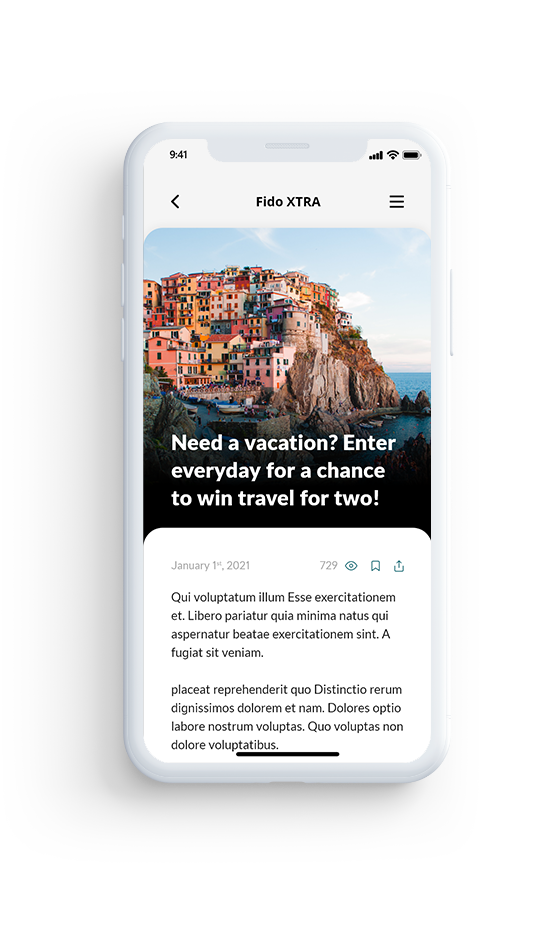
  • Improve the pathway to Fido’s member benefits program (Fido XTRA)
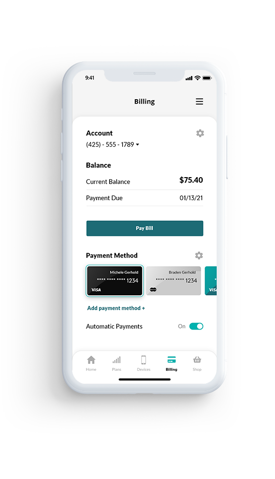
  • Allow users to save payment methods
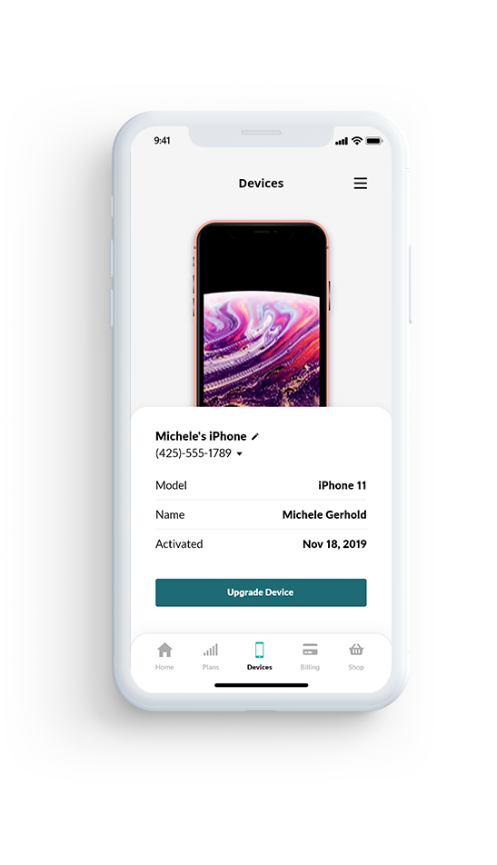
  • Simplify how a user manages multiple accounts and devices (including home internet)

App Analysis

The next step was to analyze the current app architecture to determine how and where users access information and possible pain points.

The app architecture diagram provided the following insights:

  1. There are too many pathways that end up in the user leaving the app
  2. Besides the home screen, the Fido Xtra pathway is buried
  3. There are superfluous pages
Fido App Map. Pink: Pathways to be improved. Red: Where the user has to leave the app.
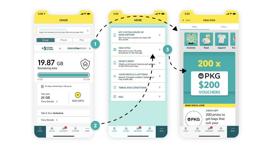
Ways a user can access Fido XTRA. 1) Homescreen Fido Xtra Perks (direct link) 2) "More" menu 3) Fido Xtra within "More" menu

Getting STarted

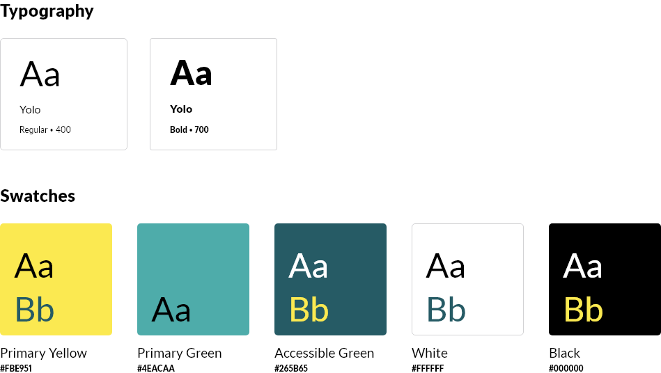
Next, I analyzed Fido’s brand to create a matching UI. Fido’s website serves the font “Yolo” and for the sake of this project, I’ll assume they use the same font on their mobile app.

Fido’s primary brand colors are bright yellow and light green. These colors are somewhat limiting as neither provides a high enough contrast ratio for use with white text and a colored background. In this case, Fido relies on using yellow with black text. This combination does provide a high enough contrast ratio but is hard on the eyes when used frequently. Fido uses a darker green (labeled accessible green in the image below) when white text on a colored background is necessary. Lastly, Fido also uses white, black, and several shades of grey for backgrounds and text.

Wireframes

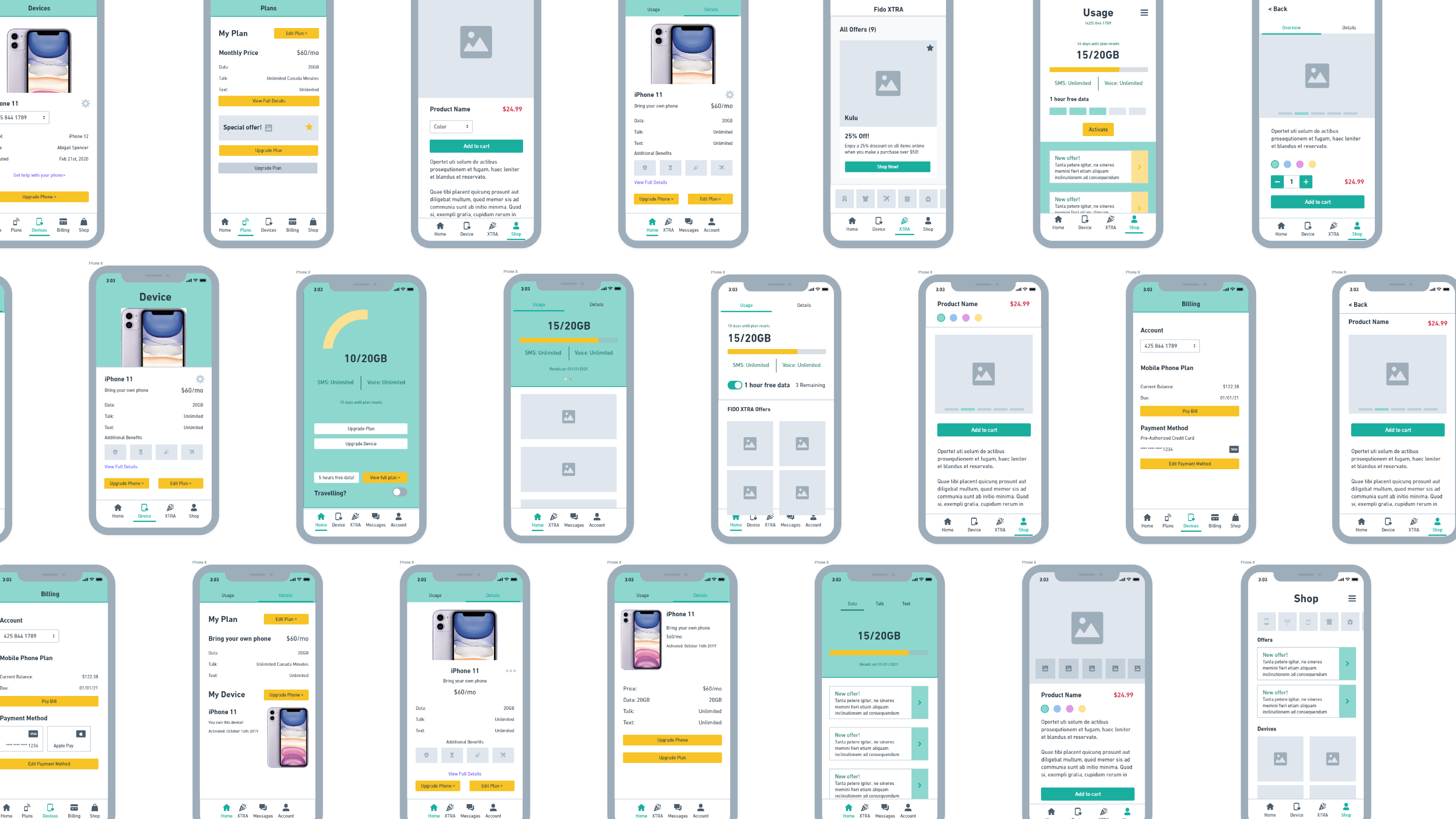
Wireframing the necessary information and navigation needed on each page was the next step. I use Whimsical for this process because of their prebuilt components and limited options. This helps me ideate quickly without getting bogged down. In a typical project, I would begin seeking feedback and user testing in this phase of the project to expand and iterate upon designs. As this is an unsolicited redesign, I based my decisions on my experience and UX fundamentals.

Establishing a UI Style

Once I was happy with the navigation and information the user needed on each page, I began creating higher fidelity mockups. Here, the new UI began to evolve as I experimented with how users interact and make choices as they move through the app.

One of the goals of this project was to modernize the UI, which I did by simplifying the current elements (removing drop shadows, borders, and background colors). I experimented with using the Fido yellow as the primary color, but I found it hard on the eyes. Instead, I opted to use the Fido green for graphs and indicators, the accessible green where I needed increased contrast, and the Fido yellow as an accent color.

The current Fido app has a “playful” feel because of the “sketched” style of its buttons, icons, and graphs. To maintain this while modernizing the UI, I based each page on a card design and used heavily rounded corners.

Final Designs

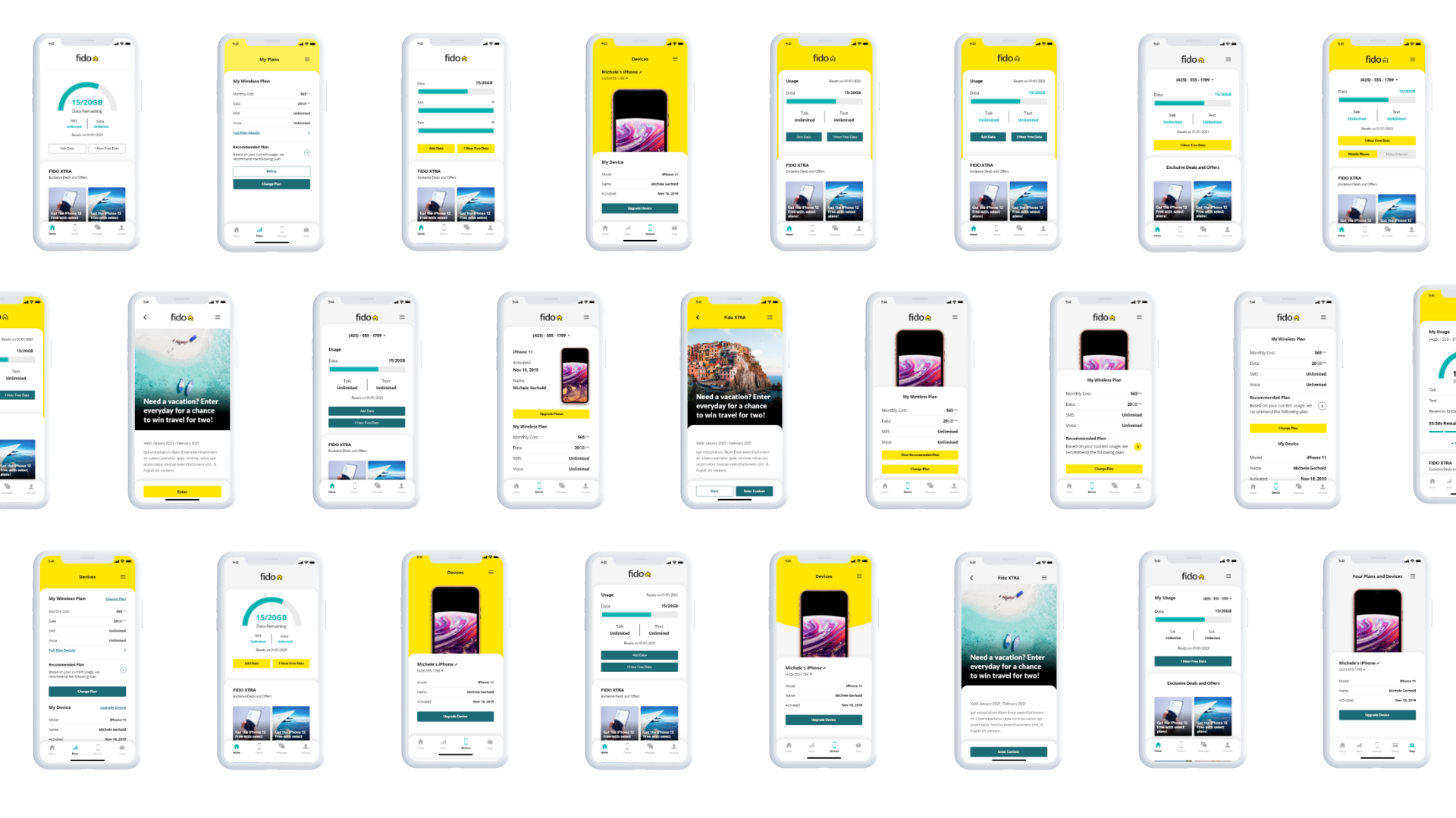
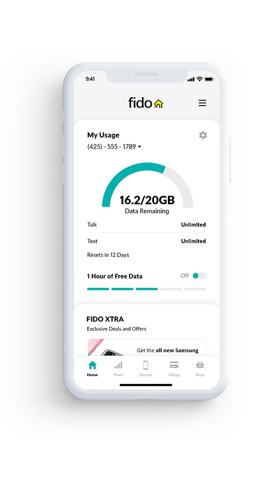
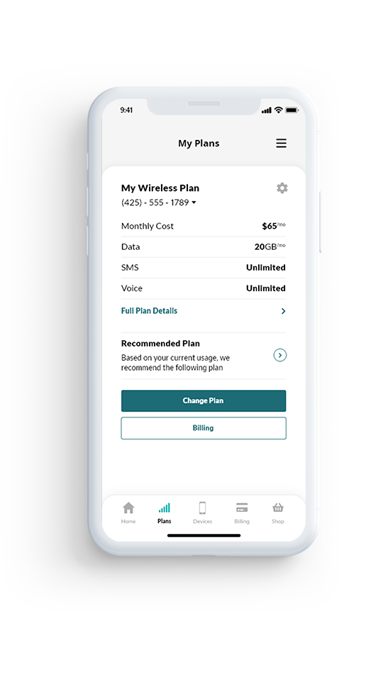
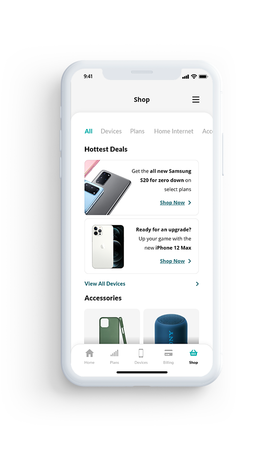
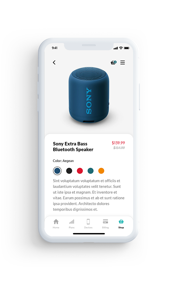
Below are the main pages from the redesign. One of the main differences was to adjust the bottom navigation bar to remove the messages, support, and more pages. By doing so, I was able to break higher traffic functions and tabs such as billing, plans, and devices into separate pages for easy discovery. This gave me more space to add the shop page where users can shop for mobile and internet plans and devices which previously required a user to leave the app.

Key Interactions

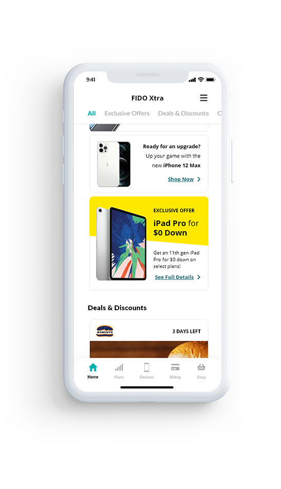
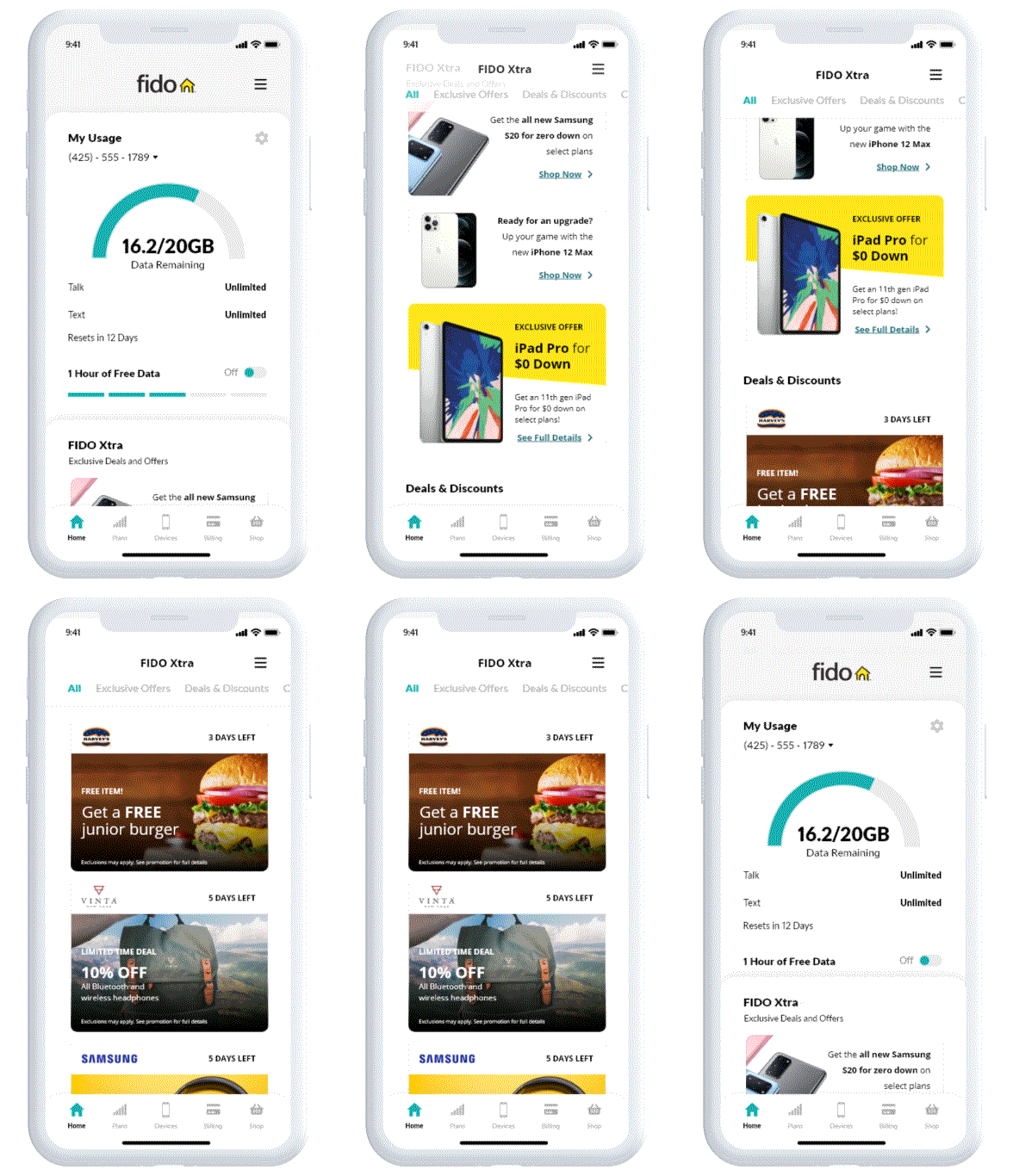
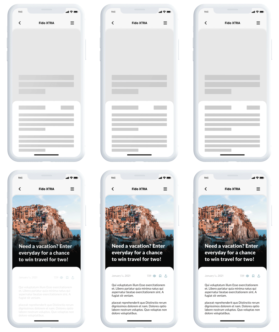
In my final design of the home screen, I placed all this information on the home page. Users no longer need to navigate to another page to access Fido Xtra but, instead, scroll down. I designed the home screen to provide all usage statistics in the top half and provide a sneak-peek of available promotions at the bottom. This layout boosts visibility and entices users to scroll, not only for new users but seasoned users as well. Exclusive offers and promotions to upsell current customers can live here as well.

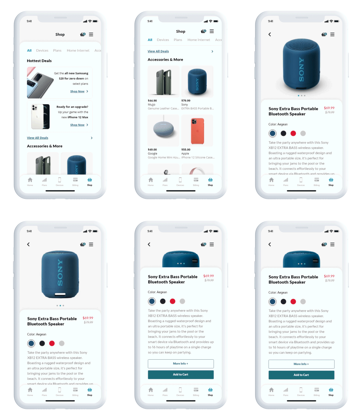
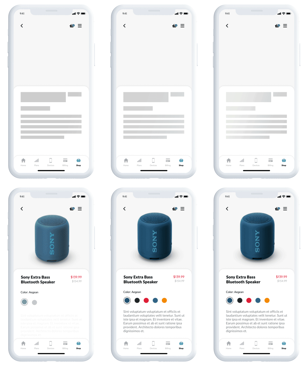
To add the ability to change plans and upgrade devices within the app, I designed a set of eCommerce pages. The shop section would include devices, mobile and internet plans, and accessories generally sold at Fido retail locations. Above is a demonstration of how a user would shop for a product.

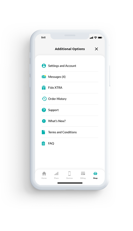
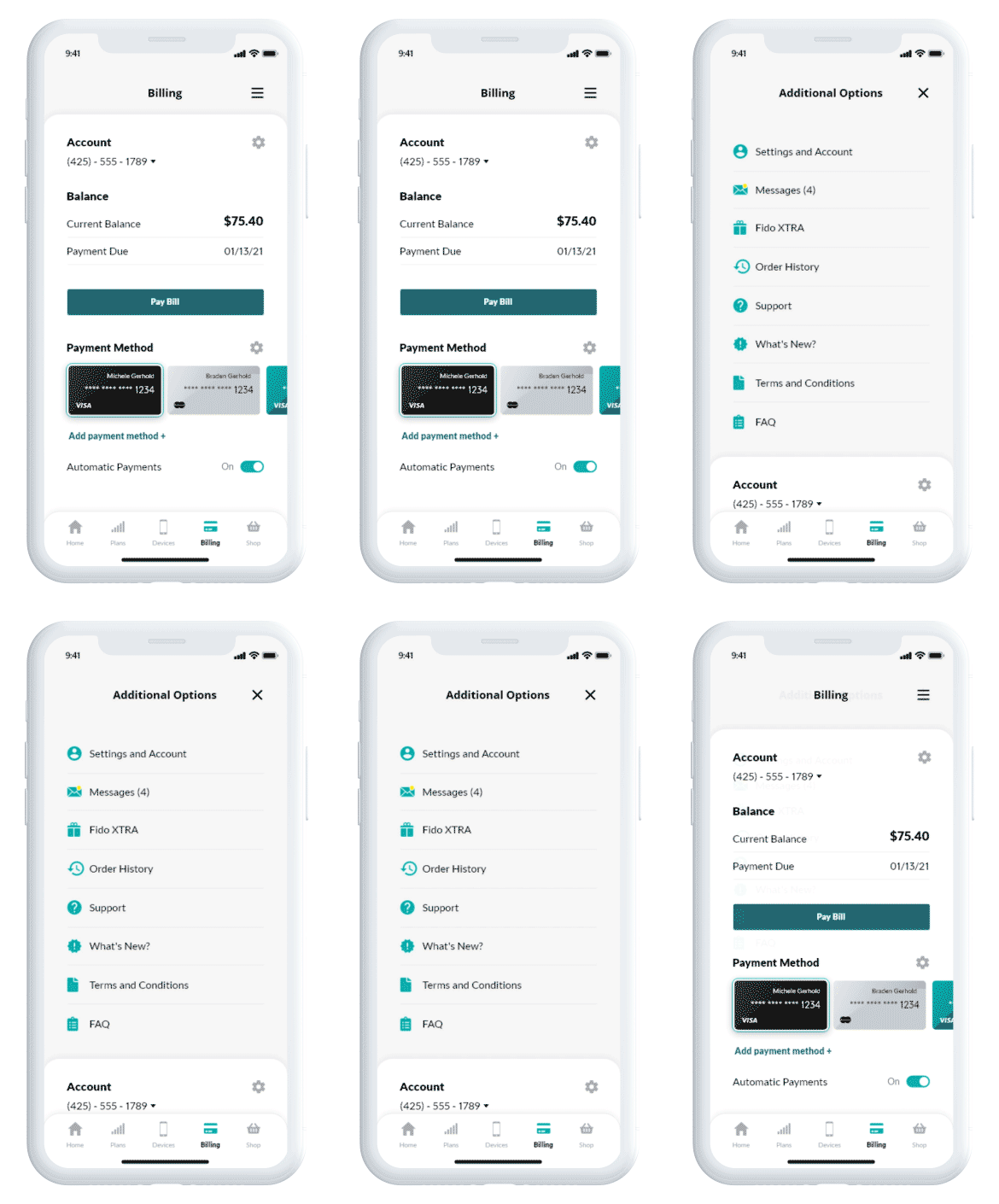
Many of the menu and support features were extraneous and were either removed or relocated to the Additional Options menu. For instance, the messages page (previously in the center of the navigation bar) serves as an alert center for new Fido Xtra deals. While important information, such as upcoming bills, is communicated through text messages, push notifications, and emails. Above is an animation of the redesigned menu deploying.

the boring stuff

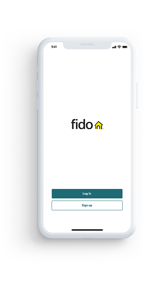
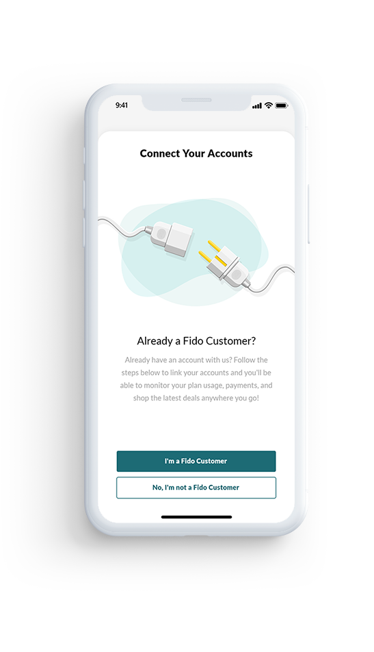
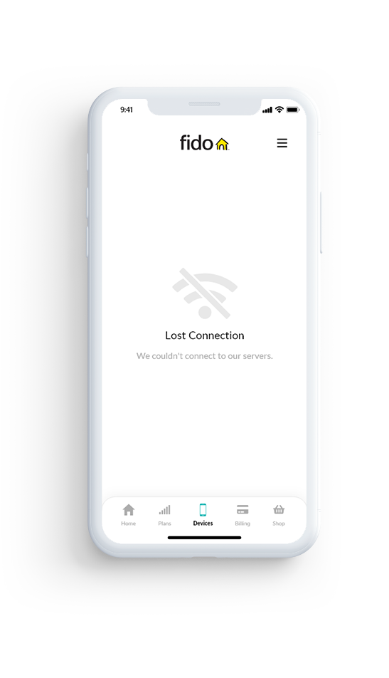
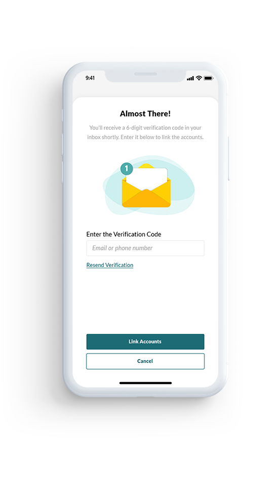
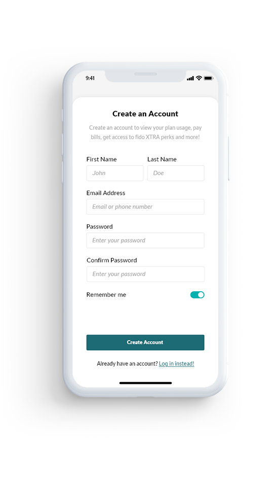
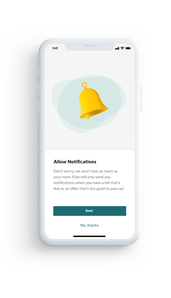
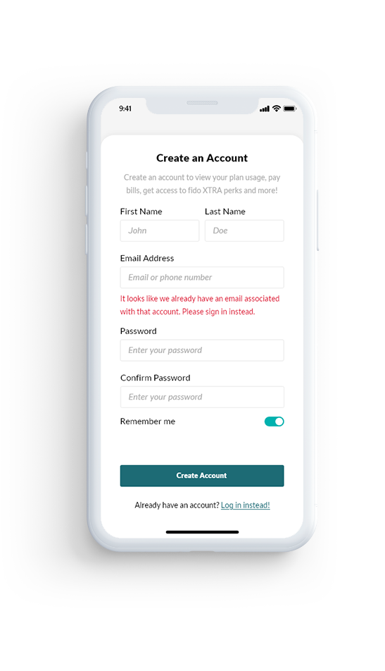
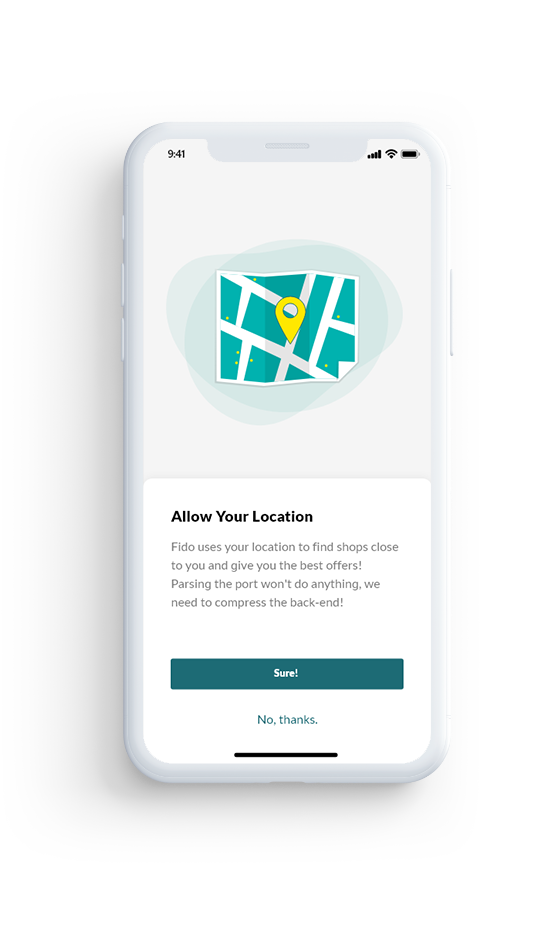
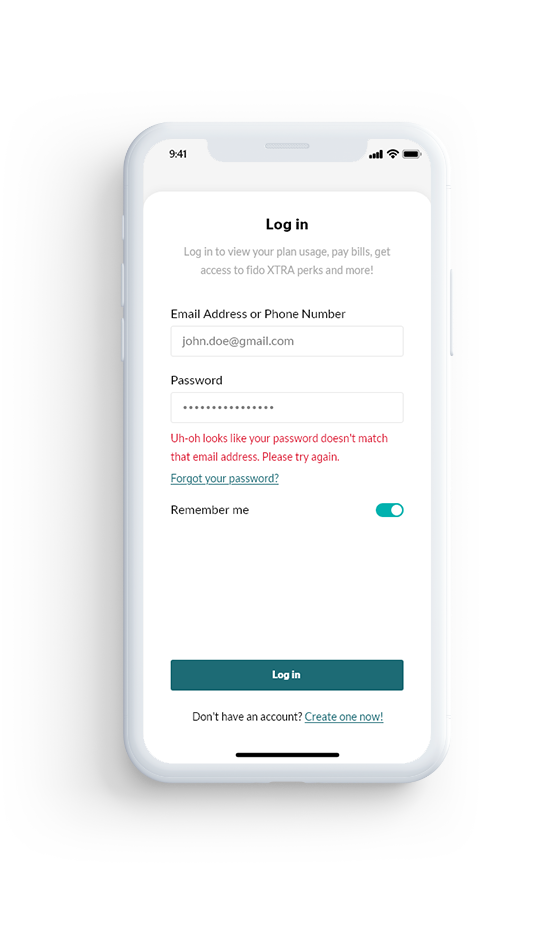
Refreshing the UI requires changes across all pages to maintain consistency. Below are a few shots of some such pages including, log-in/sign-up pages, error states, permission requests, and loading states.

Contact Me